14 Elements Every Perfect Homepage Must Have
Mar 12, 2021
Figuring out what to put on your Site’s Homepage can be pretty overwhelming…
But never fear! We’ve created this handy list to help you know the exact elements you should have. If you haven’t already grabbed your copy of our Site Clarity Map, then grab it now. It’s free and will let you visually see where each element structurally fits onto a homepage.

Click the button to register to get your free map!
Now that you can refer to the map, let’s dive in!
1) Brand Logo - Your Logo is very important to establish your Visual Branding. Make sure you have it in the top section of your Site so Visitors instantly know they came to the right place!
2) Top Navigation Bar - Amazing Audience Experience is a must! Make it easy for your Audience to navigate around your Site. The key is to make your button label naming crystal clear. For example, your About Page should be ‘About’ not ‘Check Me Out’).
Only include the necessary info your Audience needs to signup for your Free Treat or buy your Treasures (your products or services). We recommend having ‘About’, ‘Success Stories’, ‘Blog’ and ‘Get Started’ here.
3) Header Area with Headshot & Headline - Your Site is like a billboard. Your Audience needs to instantly be able to figure out how you may be able to help them. They’re cruising along the internet and if they can’t figure out what you can do for them instantly they’ll ‘bounce’ to some other Brand.
Your Header Area should include an image of you (looking trustworthy and authoritative) and your Brand’s Headline. The Headline must, in very few words, tell them what your Brand is all about and how it may be able to help them overcome their problems.
If your Header Area is not ‘idiot proof’ and visually pleasing you just lost a potential Guest*.
*A Guest is anyone who buys your Treasures.
4) Free Treat Offer with Signup - What is the goal of having your Brand online?
It’s to create an email list of your Audience who is interested in how you may be able to improve their lives.
The best way to do this is to offer them a Free Treat in exchange for their precocious email. That means you need to very clearly ‘sell them’ on what your Free Treat is, what it will do for them, and how they can get it (by entering their email and hitting the button)!
You want your Free Treat Offer to be ‘above the fold’ of your Site. What is ‘above the fold’? It simply means the specific area of your site that people can see before that have to start scrolling down. If they have to scroll down before seeing your Offer then odds are they won’t give you their email.
Make it easy for them to give you their email!
5) Authority Logos - One of the best ways to build trust with your Audience is ‘branding by association’. That means if you’ve worked for, spoken for or been featured in by any recognizable Brands you’ll want to prominently display their logos.
6) Welcome Photo - You (and your Team) are your Brand! Your Audience wants to see who you are so they can determine if they can trust you guys. This means, aside from your header image, you’ll want a second image of you here. This should portray a different side of you (or your Team) than in the Header.
Typically your Header Image would be more of a traditional headshot. Whereas your About Image might be you with your family, experiencing nature or being creative.
7) Welcome Text - You’ll want a short paragraph or two that welcomes people to your Site, explains the benefits your Site provides to them and finally invites them to register for your Free Treats. Most Brand owners make the about text about themselves. But your Audience doesn’t care about you. They care about what you can do for them!
8) Teaching Map - If you’re familiar with our Visionary Planner training system, you’ll know that a Teaching Map is a great way for you to be organized on the subjects you teach your Audience.
It also helps your Audience get clarity on the different ways you can help them. We suggest you put your Teaching Map on your homepage so your Audience can easily see ‘what’s in it for them’.
9) Treasures - Most Visitors to your Site will only visit your homepage or your blog. Therefore it’s best to have your products and services, which we call Treasures, listed on your homepage. This is because its best to think of your products and services like amazing treasures you’re giving your Audience access to.
The Treasure Sections on your homepage should include a short ‘blurb’, a product image and a linked button to learn more. The button can lead to a sales page (for a low priced item) or to an entire marketing funnel (for a higher priced gizmo).
If you’re selling software this is where you’d have details about your software and ‘Free Trial’ buttons.
We recommend you stagger your text and images left to right so your homepage stays visually exciting.
10) Destination Articles - Let’s assume your Audience has scrolled near the bottom of your Homepage. So far, they’ve chosen to ignore your Free Treat Offer, and ignored finding out more about your Treasures. This means they’re interested in what they see but aren’t ready to give you their email or money.
The best way to keep them engaged is to offer them free content. This is why you’d want to have your 3 Destination Articles here. These articles offer up tremendous value and include signup offers so they can get your Free Treats (which should compliment the article they just read).
Because you’ve divided your Audience into 3 main Desires, you’ll want to speak directly to these Desires by having these articles answer some top questions. That means these 3 Destination Articles need to be permanent fixtures on your Homepage, not being replaced by your latest blog posts as so many blogs do.
11) Social Media Feeds - If your Audience is near your footer, that means they’ve passed up your Free Treats, Treasures and Destination Articles. The last possible way you can hook their attention is to have your Social Media Feeds in your footer. This exhibits social proof about your Brand (all the other Audience who have liked your Social Media Channels) and shows you’re keeping your Brand up to date (by showing all your recent social media posts).
We recommend you definitely have Facebook here. You should have a 2nd Social Media Channel…Twitter or Instagram work best. So decide which is most appealing for your Audience.
12) Contact Info - It’s best to be transparent with your Audience. You have nothing to hide, so display your business address and contact info for them to see. This also makes Google happy so they show your site in more search results. We recommend you put your business phone and support email here.
Beware!
There are nasty little things called ‘search bots’ that will crawl the internet and look for support@ emails. If your support email is ‘[email protected]’ then chances are high this email will get tons of spam. Therefore I recommend formatting your email to look like this: ‘Support (at) YourSite.com’. Or, better yet, use ‘[email protected]. Search Bots typically aren’t looking for the ‘HelpMe’ email prefix.
13) Footer Navigation Bar - It’s critical that you have your legal pages visible from every page on your site.
For this reason you’ll want to include your Privacy Policy and Terms of Service pages in your Footer Navigation Bar. You should also include your Contact and About pages to make it easy for people to get around your Site.
If you have an affiliate program you’ll want to include a link here to a sign up and info page. Having other Brands promote your Treasures is a great way to boost revenue!
14) Copyright Info - Protect your intellectual property by including your Copyright Info at the bottom of your page. You should include the original year you made your site. Also write ‘all rights reserved’ to protect yourself. Please note our Team here at The Visionary Planner are not a lawyers, so consult with yours to verify what we’re recommending. We will never give you legal advice*.
*This statement makes our lawyer happy.
Wrap Up:
That’s it!
Once you have these 14 steps on your Site’s Homepage you can start to let your Audience know about it! Fingers crossed they love what they see and buy your Treasures! Ka-ching!
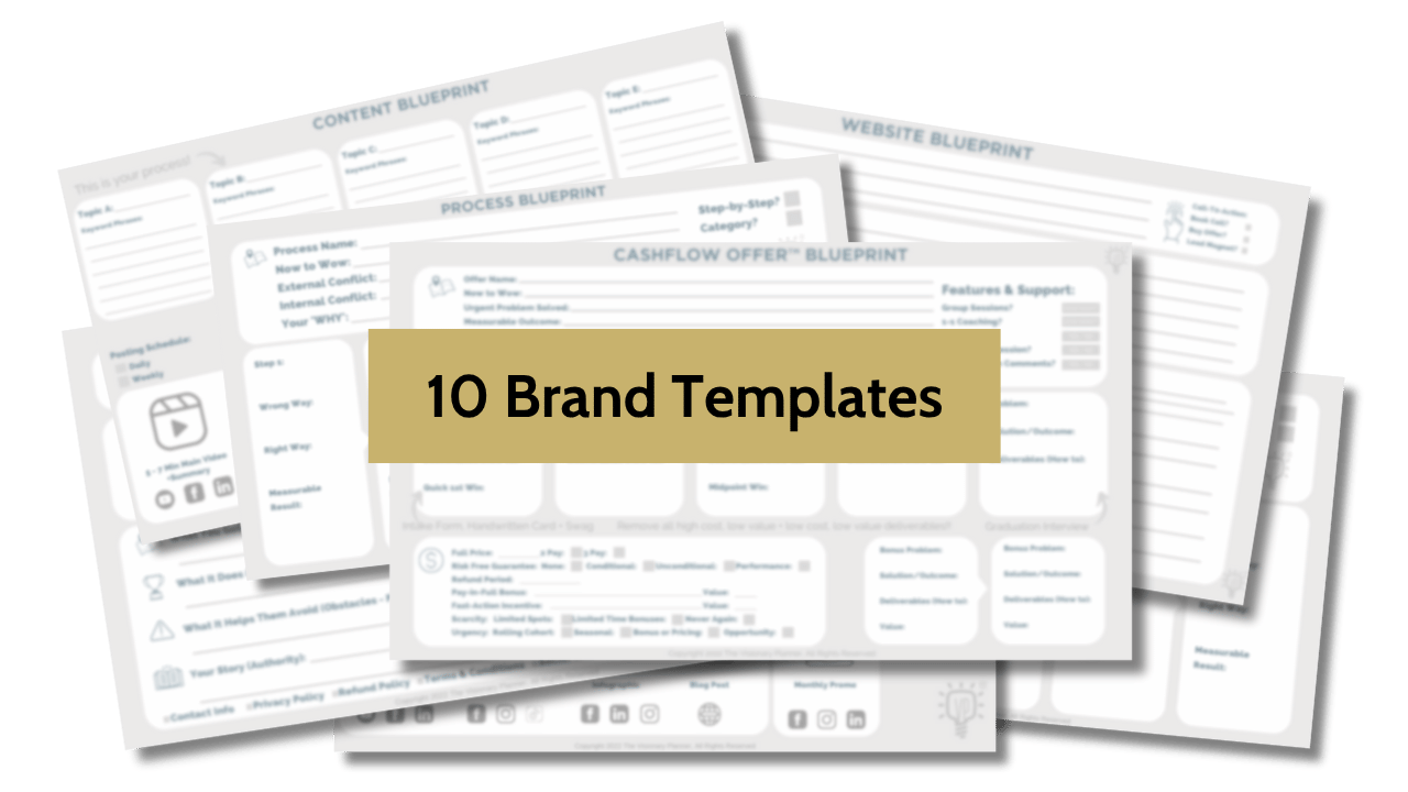
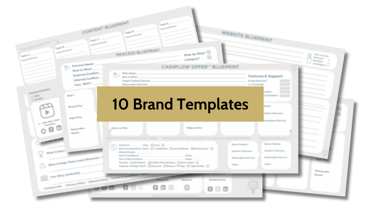
Unlock Our Brand Vault (Free)
Get instant access to the 10 brand tools we use with our $4,200 clients. These frameworks have helped B2B leaders land premium clients, get featured on top podcasts, and clarify messaging that converts, without overhauling their website.
We hate SPAM. We will never sell your information, for any reason.
Author