Lookbook: The Efficient Way To Have Your Brand Look Like A Million Bucks
Oct 23, 2019
Don’t worry if you’re not sure what a Lookbook is—it’s not complicated, even if it’s an unfamiliar word. A Lookbook is basically a series of design rules that dictate the exact style of your Brand. The point is so that anybody who works on the visual design of your brand identity knows exactly what they’re doing and how they’re going to do it, whether they code your site or do your logo design. With a Lookbook, you’re going to achieve absolute design consistency, which is exactly what you want.
Colors and Fonts in a Lookbook
The key reason why you’re going to need a Lookbook is design consistency. Visual Branding is built from a number of key components:
colors, fonts, logo design, shapes, and brand emotions. The point of your Visual Branding is to create an audience experience, and you want that audience experience to be consistent. So, let’s explore what that means.
One example we’ll come back to time and time again in this series is Disney and Disneyland. Each area of Disneyland has a different look; a different Visual Branding. Adventureland is, well, adventurous: a little dangerous, but exciting at the same time. Fantasyland is more magical and whimsical, whereas Tomorrowland is futuristic and optimistic. Each area of the park has to give a completely different impression, and that’s done through visual design and visual branding.

Adventureland, Disneyland
The way that Adventureland gets that feeling across is exceptional. They use fonts that draw on 30s-50s travel advertisements; and everything is greens and browns, like an Indiana Jones movie. There are also plenty of sharp shapes and dangerous decorations like Tiki masks, fire and spears. Everything is sharp lines, right down to the triangular palm tree fronds and ancient South American- and Indian-style architecture. You feel like a Victorian explorer, discovering a land that time forgot.
Fantasyland, by contrast, is softer and more ornately colorful: plenty of royal purples and deep blues, and cursive fonts. The entire experience is far less threatening (Adventureland is ‘threatening’ in the way that kids’ movies warn you about ‘mild peril’). The shapes of the architecture, the fonts, and everything in between are rounder and more fanciful. You’re left with the impression of walking around a real medieval Bavarian village.
How Does That Translate To Branding?
Now, this might seem a little off-topic. But it’s really not. Walt envisioned that these designs would foster a certain kind of feeling in his audience. A Lookbook describes what kind of design you’re after, in exactly the same way: do you want your Brand to convey, hope, optimism, or joy? Or power, confidence and effectiveness? Let’s examine these design principles with some real-world examples.
Say my Brand is a line of toys for girls. Our Visual Branding isn’t going to be dark and brooding; it’s going to be round, bubbly, pink and sparkly. Conversely, if my brand is for older men, it’s going to be sharp, edgy, red and black. Think of Barbie and Harley Davidson. Their visual branding isn’t interchangeable: guys into Harley Davidsons wouldn’t buy them if their logo was pink, girly and bubbly. It’s the wrong identity for the wrong brand.

A Lookbook is what you use to define your Brand identity during the design stage. Once you know what kind of identity your Brand is going to have, you’re going to collate everything important about it—the fonts, the curviness, the color, everything—in one place; basically a set of guidelines. These guidelines are what you’re going to provide to every designer, every agency you work with when you build your Visual Brand.
Before we move on, and this is especially addressed to everybody out there who’s DIY minded, it’s perfectly possible to make your own Lookbook. You don’t need to be a designer, and you don’t need experience drawing or using Photoshop. What you need is a Clear Vision, a clear Idea of what you’d like your Brand to look like and what you’d like it to represent. That being said, you’re always free to hand over the reins to a qualified designer, brief them as thoroughly as you can on your vision, and let them create a Lookbook for you. In the end, it doesn’t matter what your Lookbook looks like; it’s the message that matters.
Why Do I Need a Lookbook?
If you’re reading this, you’re most likely working on a small business, a small Brand. So the odds are that you’re not going to be able to afford a big name designed or an agency that can take care of all of your branding and design for you. You’re going to be outsourcing to designers, either online or in real life, and you’re going to need to direct them on what you want your brand to be.
When you start on your designs, and pass them off to the designer, letting them go hog wild and do exactly what they want is a recipe for disaster. You’re going to get something back that’s completely off brand. Give them a Lookbook, though, and you’re going to get exactly what you want 90% of the time. And when you don’t—say they used the wrong font or the wrong color—all you have to do is refer them back to the book. It’s going to make your life a whole lot easier in the long run.
If you don’t use a Lookbook, or don’t have any coherent design ideas at all you’re going to end up with something like a hot mess. If you’d to see what we mean, check out lingscars.com—Ling, if you find your way to our post here, thanks so much for the example.

The site is interesting, but from a design perspective, it’s a mess—a cluster of a dozen different fonts, a garish background, gradients, brash colors… Now it’s clearly working for Ling, but it can’t work for everyone. Your brand is going to be far more effective with a cohesive, clean and easy to understand Visual Design.
Another thing you have to consider is that your Vision, Mission and Brand Emotions are all communicated through your Visual Design. If you’re unsure as to what any of these things are, by the way, we recommend that you read over this series from the beginning—this is the third of a 23 part series, and everything fits together sequentially, so it’s vital that you understand what Vision, Mission and Brand Emotions have to do with building a successful brand. Anyway—back on topic.
Your Visual Design is what communicates Brand Emotion. Whether you want your Brand to be classy, clean, urban or cool, doesn’t matter unless you communicate through your Design. And in much the same way you want your customers and clients to understand what your vision and mission are through your branding, whether you want to save the rainforest or offer the best legal services in town. A Lookbook will help you do just that.
What Should I Have In My Lookbook?
Section 1: Logos
Some Logos are longer than others, some taller. Our lookbook contains every logo we need, so that our designers can include the correct ones where necessary.

There are also our other logos, like our light bulb logo, which we use here and there in our branding. Every image along these lines is included. It could be anything from an advert to screenshots of your website design… So long as the image effectively captures something that you’re trying to convey with your Brand, you should include it.
Section 2: Fonts
Included every Font that you use. In our example Visionary Planner example, we have our primary font, which is the unique one in our Logo. We use it sparingly in our designs—which is an instruction we include in our Lookbook—because if you had to read a thousand words in it, you would find it a little hard to get to the end. We’ve included each font that we use, including the one that you’re reading this post in.
Most brands stick to two different fonts, one called a primary font, and the other an accent font; don’t make things too complicated by having more than two or three. The reason you shouldn’t use too many fonts is that people associate brands with fonts. Go ahead and think of some famous fonts: Nike’s block print capital letters, conveying action and attitude. Apple’s smooth, thin, curved lettering, futuristic and clean. McDonald’s round and welcoming font. You want to convey your brand in the way that these brands do.
Section 3: Colors
Besides the Font and Logos, detail and list each one of the Colors that you use. Every single one that forms a part of our Branding.

The key is to make your Lookbook idiot-proof, so include a sample of the color along with a hex code, so that a designer can easily replicate these colors in any kind of graphical software.
Hex codes and other kinds of color code ensure that your designer is using the exact color that’s right for your branding. Shades of color really make a difference. To return to our example above, think of McDonald’s welcoming red and yellow visual branding. It wouldn’t be the same if they used, say, black and purple!
Section 4: Design Motifs
You’re also going to want to include your design motifs. As an example, look at Apple, and the way that they advertise their products. It’s consistent, and it’s consistently good. First, the background of each ad is always plain white. There’s also almost always a reflection below the product. Go take a look at Apple’s site, and take note of how each and every ad fits into a wider style. That’s the kind of style, the kind of design motif you’re going to want to include in your lookbook. Include a visual example as well as a description of the style you’re going for (crisp, clean, urban, etc.)
You’re going to want to bring together all these points in whichever format you choose. That could be a .pdf file, it could be a Powerpoint, or it could be a simple Word or Pages document. The most important thing is that you’re able to share your Lookbook with any designer you work with, to keep them on the right track.
Wrap Up
So, by now we hope you’ve learned exactly what a Lookbook is and why you’re going to benefit from creating one. Your Lookbook is essentially a tool, a tool that you can use to communicate your Vision, Mission and Brand Emotions to your Audience (anybody who hasn’t yet bought a product or paid for one of your services). And if you can communicate your Vision to your audience, you’re halfway to bringing it to life.
As we mentioned above, this is the third instalment of an ongoing series, and it’s really going to benefit you if you start from the beginning. If you found this post through Google or our social media, you should get back to Block #1, the very beginning of our series, which is about Vision and Mission.
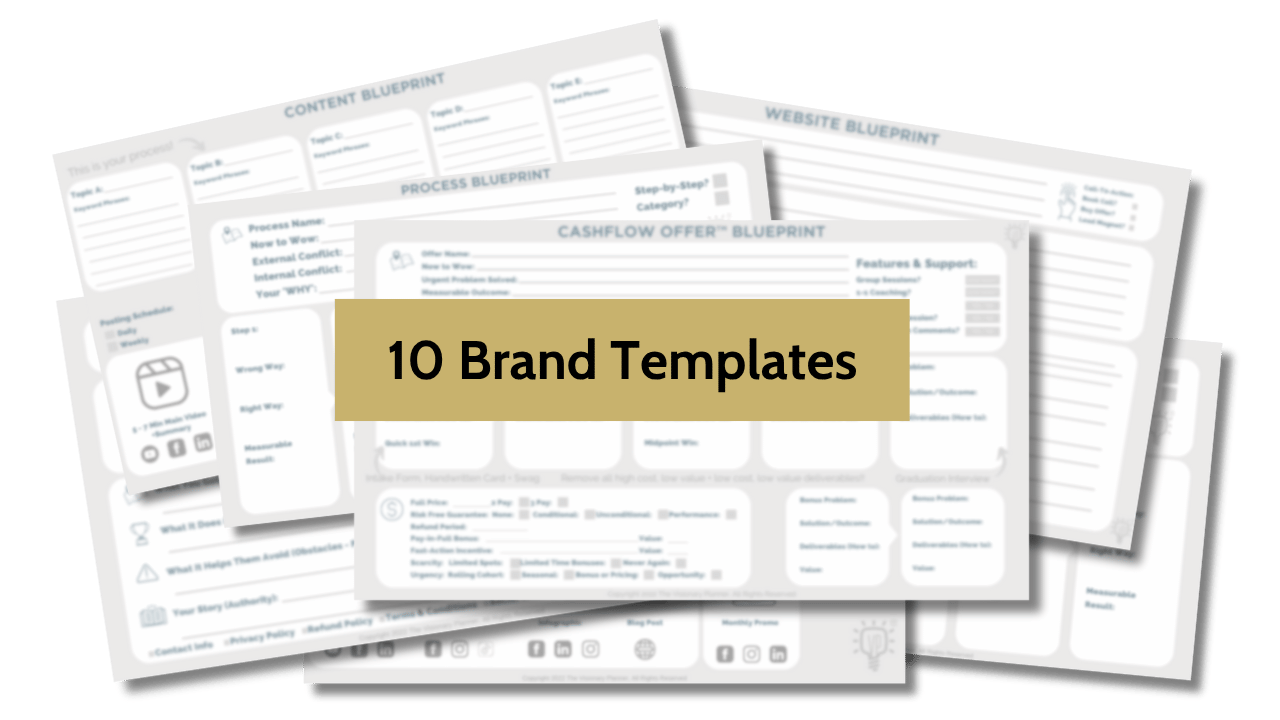
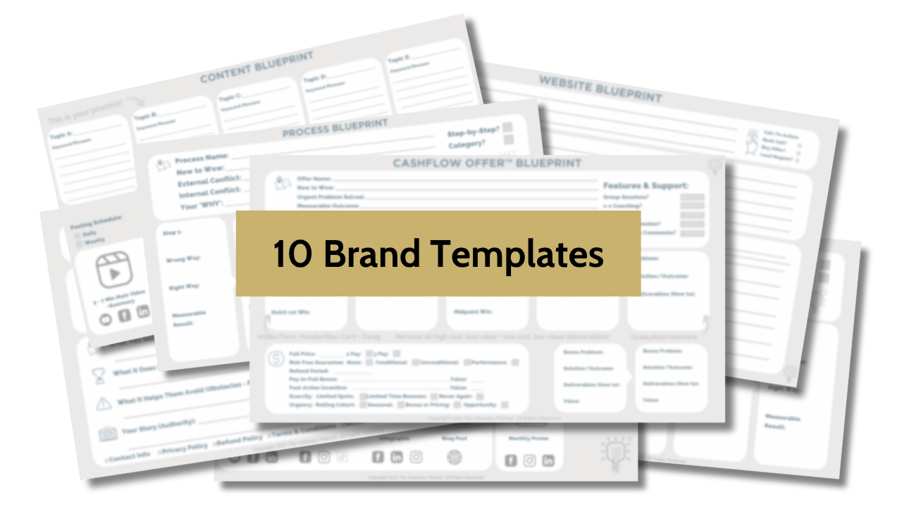
Unlock Our Brand Vault (Free)
Get instant access to the 10 brand tools we use with our $4,200 clients. These frameworks have helped B2B leaders land premium clients, get featured on top podcasts, and clarify messaging that converts, without overhauling their website.
We hate SPAM. We will never sell your information, for any reason.
Author